Swatch module
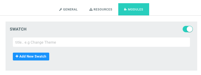
The Swatch module allows users to change a design’s color theme and background within the application. It allows the admin to set colors, preview and background images per set of theme. So let’s assume you want a light and dark version of your business card design. With the Swatch module on one design, you can add either of the other color mode without having to create two separate designs, You can set element’s colors for text and shapes, set a background color or image and assign a preview picture so when that theme is selected in the product page, the preview image shows the appropriate view before going into the application. You can view a live sample here: Swatch business cards demo Setting up the Swatch Module To enable this feature, navigate to your designs page, simply click the Configure button on the design you like to assign this to. Then navigate to the Modules Tab, there you will find the Swatch module. Toggle the Switch to the On position and the options will appear as shown:
Swatch module options revealed after toggling the switch on
You can give it an optional title or leave that as blank. Click the Add New button to add a new theme to your design.
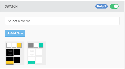
Two themes added to the Swatch module
In the picture above, we have added two themes. Each with an option for 3 colors, a preview and background.
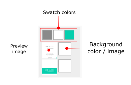
A theme item showing its three colors, preview picture and background
Swatch Colors:
These are the 3 colored boxes on top of each theme item, they correspond to swatch1, swatch2 and swatch3 in that order. You link these colors to elements on your page by adding either swatch1, swatch2 or swatch3 to the chain value in your design.

A design element with its chain value set to swatch1
So any element that has its chain set to swatch1 in that design, will have its color changed to the color value you have set of swatch1 for that theme when that theme is selected by the customer.
You can use comma to delimit other chain values you might have there. For instance, in the image below, the text element has a chain called name, we added swatch1 to it

Text element whose chain value is name with swatch1 added
Preview Picture:
When a theme is selected on the product page, the product view should change to reveal that and this is where you set it for each page of your design. Click that image to select a picture or upload a new one for that preview. You can do this for all the pages in your design.
Background Image / Color:
Based on the design pages, you can set the color or background image that should be used for each theme when selected. If your design page has a color, a color selector is presented or if an image, then an image selector is what you see. It’s not possible to cross options here; it follows what the design page has.

Color Palette

Create five-color complementary themes customers can sample to restyle a design.

Template Color Module

Let customers switch template images, such as T-shirt colors, at design time.

All About Colors

Understand PitchPrint’s color system, including Hex, CMYK and SPOT values.

Template Colour Designs

Learn what template-based designs are and how template images are swapped in the editor.