Color Palette module
A Color Palette is collection of five complementary and contrasting colors that forms a theme. This collection of themes can easily be sampled by clients to pick the one that suits their taste and style. This also limits the number of colors displayed in the app to five at a time, which helps them make better design decision faster as against battling with indecision as to which color fits what.

How to create your Palette

To get started, you will need to create or import one or more palettes into your store. Navigate here to your admin colors page: Colors page You should find the Color Palettes panel on top, perhaps empty if you have not created any.
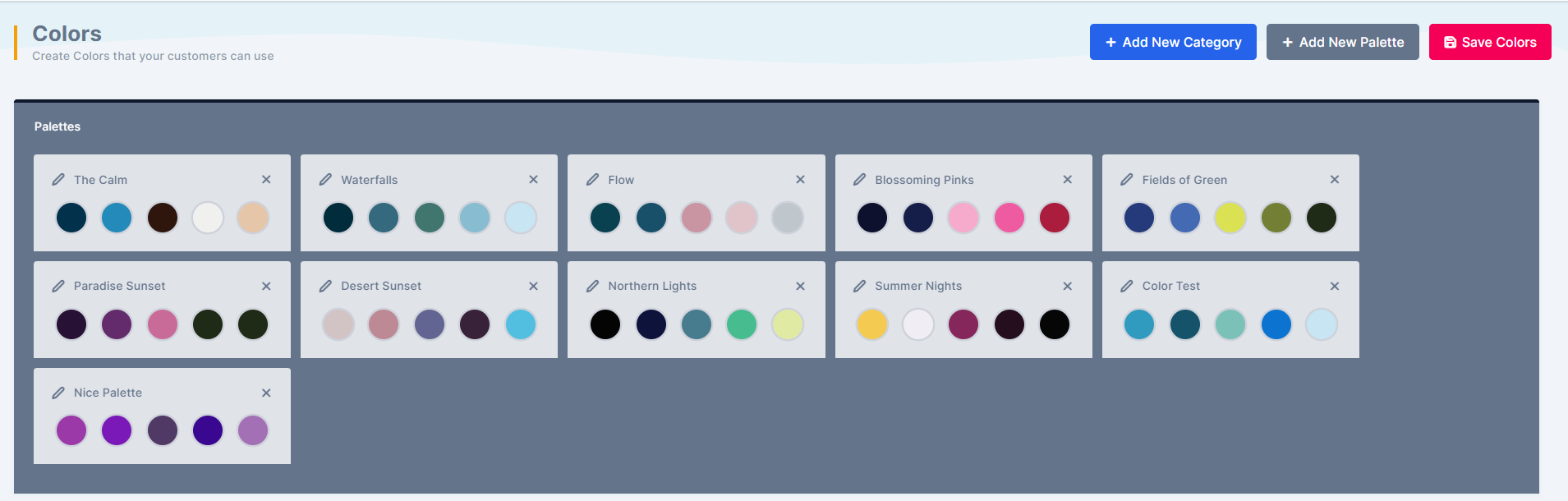
Empty Color Palettes panel at the top of the admin colors page
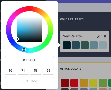
To get started quickly, you can import from our sample collection by clicking the Add New Palette button. This should add a new Palette you can then edit the name of the palette as well as edit the 5 default colors.
A newly added palette with an editable name and five default colors

How to apply a palette to design elements

You can do this as an admin editing a design. Navigate to the design section: Designs page Start by editing or creating a new design. On the top secondary menu, you should find the Palette Mode toggle button as shown below:
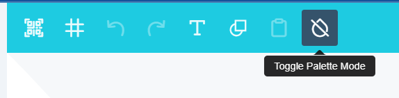
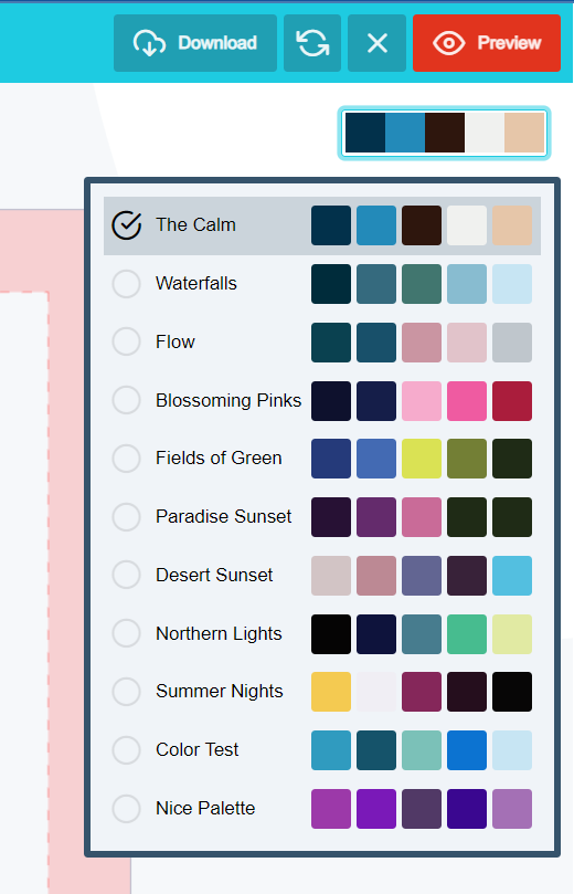
Palette Mode toggle button on the design editor's top secondary menu
This button toggles the design color mode between the regular color collection and palette colors. When turned ON, you will find the current palette displayed next to the button. You can click on the Palette to change it to a different palette.
Palette Mode turned on with the current palette shown next to the button
Once you are in Palette Mode, next is to set your base color, which usually is the background color. So on your background tab, select the color tool and apply either a dark or light background color. To create highly vibrant design, your background will contrast the element colors. So if you pick a dark background, then be ready to apply light colors to your elements and vice versa. Each color on the Palette has an index which is traced across when the theme is changed. So assuming you picked the second color of the palette as your background, when your customers change the palette on the app, the background will change to the corresponding second color of the selected palette. This goes with the elements as well. After setting your background, you can go ahead and set colors for your elements one by one. For multi-colored shapes, you can assign individual colors to each node as well. Now try swapping the selected Palette to see how it reflects on your whole design. See what palette appeals and make a note of them, you will need that in the next section. You can save your design.

How to assign Palette resource to your design

From the previous section, we have noted which of the palettes goes well with our design. Next is to assign those palettes to the design and exclude the rest. In your designs page, click the Configure icon
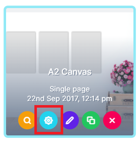
Configure icon on a design in the designs page
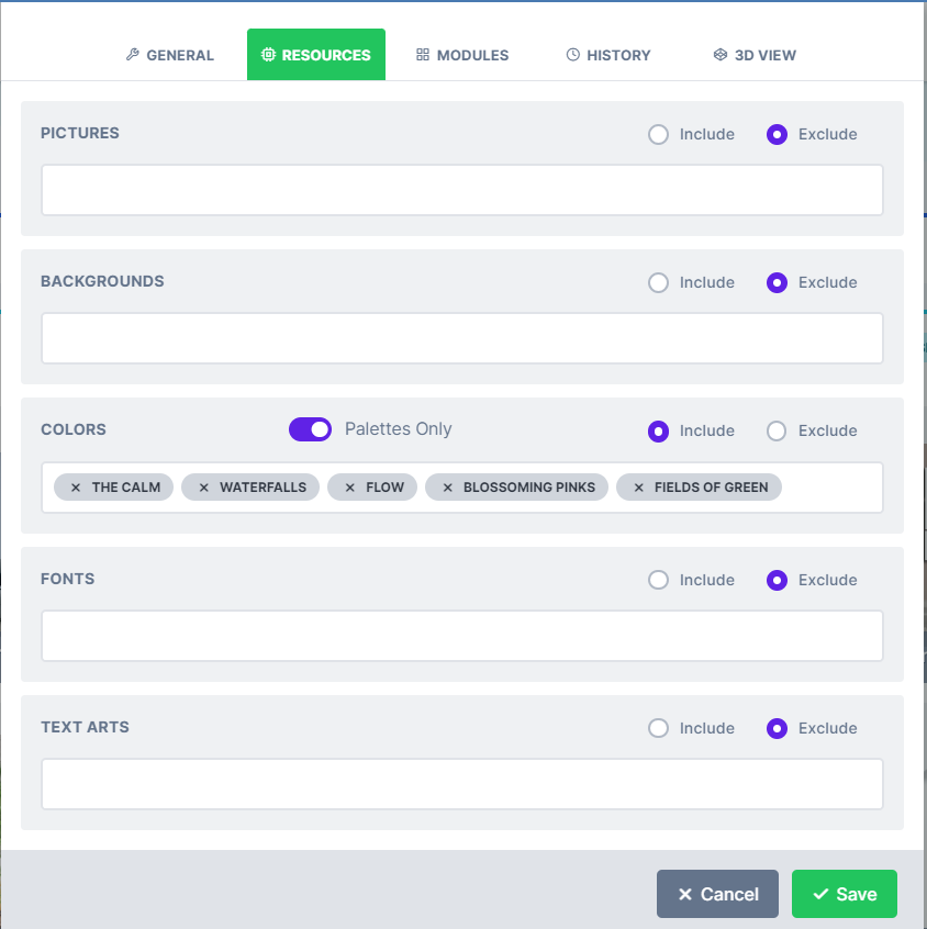
In the resources tab, turn on Palettes only for colors and select Include:
Resources tab with Palettes only turned on for colors and Include selected
Next, make a selection of those palettes you have noted to flow well with your design and Save. Finally, check your product and launch the designer to see. You can view a sample product we have made here: Palette business card demo

All About Colors

Understand PitchPrint’s color system, including Hex, CMYK and SPOT values.

Swatch Module

Let customers switch a design’s color theme, background and preview within the editor.

Template Color Module

Let customers switch template images, such as T-shirt colors, at design time.

Template Colour Designs

Learn what template-based designs are and how template images are swapped in the editor.