

Design Categories
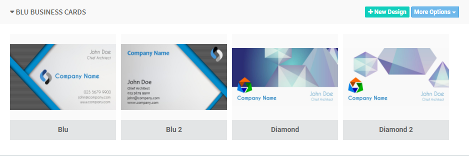
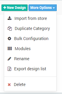
How to Create a new Design
This topic is pretty expansive and has been covered in another documentation. Click here to learn How to create a new DesignConfiguring each Design
Each design in a category can be managed by moving your mouse over each to reveal a set of menus against it, as shown in the image below: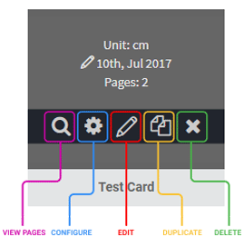
General
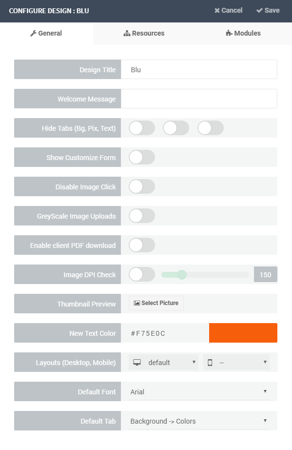
The General tab holds the core settings for a single design.text
The design’s label.
text
Write a custom message or instructions which will be shown once the application is launched and the design is shown.
text
Add tags which allow you to assign a layout to a design. Have a look at the following document to learn more about layouts and tags.
toggle
Displays or hides the customization form that should appear once the design loads. This form is a quick means of allowing customers provide their details especially for text based designs in an easy to edit form. Whatever data they provide is used to update the design. To understand how this works, read more on the topic: Item Names & Chains
multi-select
Toggles visibility of each of the 3 tabs: Background, Pictures and Text tabs. By default, they are all off, which means they will all be shown. If for example you don’t want customers to change this design’s background, then you can turn ON the first switch and when the application loads, the background tab will be hidden.
toggle
The customer cannot change the background.
toggle
Customers cannot click images on the left Pictures panel to add them to the canvas. They will only be able to drag and drop their pictures. You may need this feature if you have a canvas design with mask spots where you only want users to drag pictures into specific mask containers, as against clicking which will just place it on the canvas.
toggle
Item snapping is limited to page boundaries only.
toggle
A premium feature that converts any user uploaded images into greyscale while in this design. You may need this feature if your product can only be printed in black / white and non-color.
This is not a site wide feature.
toggle
Allows your customers to download the PDF after creating their designs.
toggle
Each mask will be split into a PDF.
toggle
Colors with the same chain values will be synced.
number
Sets the DPI limit for any picture your users can add to the canvas. For this design, this value overrides the one you might have set on the settings page. Read more here to learn more about DPI Check
color
Sets the default color of any text created by the user while editing this design. You can supply the RGB and CMYK values. To read more about colors, please click here
image
By default, the app uses the design page snapshots as previews where the design is required to be displayed, like in the design selector module. If however you set a thumbnail here, this will be used instead of the design snapshots. This can be used to show how the design looks on a product.
select
The default font for this design. When a new text is added to the canvas, it uses the font you have set here.
select
The default tab that should be shown when the design loads. For instance, if it’s a photo album design, you may want them to see Photos -> Upload so customers get straight to work uploading their photos.
select
Sets the layout that should be loaded for this design. You can set different layouts for both mobile phones and desktop. Selecting the first — option for mobile means it will use the default PitchPrint mobile layout, which we strongly advise. You can read more about layouts here.
Only available on version 9.
select
Select the unit of measurement for your design. We have five different units to choose from: Centimeters, Millimeters, Inches, Feet and Pixels.
regex
Limit the characters a user can type into the designer by using Regex.
number
Set the minimum font size that will be used when text is added to this design.
Resources
The resources tab allows you to sieve or filter what resource gets loaded per design. This is for Pictures, Backgrounds, Colors, Fonts and Text Art styles. There are two modes to choose from Exclude or Include. If you select Exclude and nothing was selected in the input box, this means every category in that resource will be loaded when that design loads. If still you have Exclude but selected certain categories of resource, then everything will be loaded EXCEPT those you have selected. The reverse is for include.Modules
Here, you will manage and assign modules to each design. Please read more about individual modules hereRelated articles
How To Create A Design
Build your own design template step by step in the standalone editor.
Design Configuration
Reference for every design setting across General, Resources and Modules.
Types of PitchPrint design
Understand the four canvas layers and the three main design types.
How to import designs
Import ready-made designs from the PitchPrint store into your categories.