> ## Documentation Index
> Fetch the complete documentation index at: https://pitchprint.com/llms.txt
> Use this file to discover all available pages before exploring further.
# Admin Design Editor
> Reference for the admin editor's page and item panels, covering bleed, margins, fold lines, smart sizes, labels, chains, locks and hooks
Designs are created using the PitchPrint editor through the admin portal. This has an extra panel which functions are listed as follows:
Depending on the context you are in, you either see the page panel or the item panel as shown:
**Page Panel**: Used to create, edit, clone or delete pages.
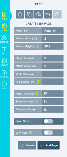
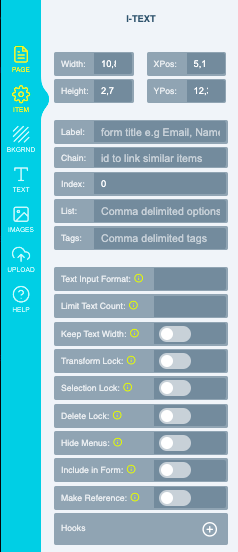
**Item Panel**: Shows when you select an item on the canvas. It is used to edit item properties. This panel appears whenever you click an item on the canvas.
## Page Panel
Fields available when you are creating or editing a page.
Click the title to type in your page title.
Defines the final width and height of the printed PDF file. In a plain design like Business Card, Flyers, Stickers etc, this is the real dimension of the design area in physical units. Not Pixels.
Allows you to insert a page in between existing pages. By default, it should be 1. If you have other pages and you want to insert a page before page 3 for instance, then you should enter 3. So your new page becomes page 3, pushing the rest further.
A single bleed value can be provided and will be used to demarcate cut lines.
The bleed is part of the final design size here. So if you have 10cm x 12cm with a bleed of 0.5cm, the final PDF will still read 10cm by 12cm and take off 0.5cm on all edges and place the cut marks there.
Shows similar to the bleed line but is shown as a solid line and not used for cuts.
Lines drawn on the design canvas to guide your users on folding portions within your design. For instance, if you are designing a greeting card, such could have a horizontal line depicting where the card will be folded, but will never be printed in the final PDF file. You can provide as many fold lines as you want by using comma to delimit each. No spacing, just comma.
There are places where the design preview is required, like on your product page. By default, we normally use the design preview but this gives you the option of setting a different picture to be used for previewing each page.
Set the template image if you are creating a Template based design. [Kindly read more here](/docs/tutorial/types-of-pitchprint-designs)
Set the foreground image if you are creating a Foreground based design. [Kindly read more here](/docs/tutorial/types-of-pitchprint-designs)
Create different sizes for each page of the design which the customer can choose from. [Kindly read more here](https://blog.pitchprint.com/smart-sizes/)
Prevents the customer from editing this page.
Click the **Make Page button** to add the new page to your design.
## Item Panel
Properties of the item currently selected on the canvas.
The basic property of the selected item. You can click the padlock icon to lock the width / height ratios while editing.
The title that's displayed for the item when a form is displayed for this design. It can also be used to pre-populate a text value with the user data when the app loads. These values are supported by default: Email, Phone, Address and Name. For example, if you have a text on the canvas and you gave it a Label *"email"*, when that design loads on the product and your user is logged in, this text will be automatically filled with the user's email address. If the user is not logged in, we will just display the value you have provided.
On a form, this is used as the label as shown below: *Name, Title, Phone Number, Logo etc are each Labels assigned to different text elements..*
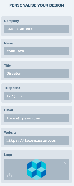
The chain value is used to link text and photos together so they share the same value. For instance you have several email elements on the canvas, if they all have the same chain value, when one is edited, the remaining ones also get their values updated. Same with photos. You can come up with any value for a chain but they must be exact and are case sensitive. You can have multiple chains separated by comma and no spacing.
This is different from the Label.
An integer that allows you set the display hierarchy of items in a form. Every item has a default index value of 0, so you can have a positive or negative value. Items with higher values will be displayed first. In the form displayed above, Name has a higher value than Title.
Creates a list of elements, each item will contain a comma after to separate the elements from one another.
Add tags to enable extra functionalities.
Format input text, for things like Email address, ZIP code and Phone numbers etc.
Leave this field blank if you do not need it.
Limit the amount of text that can be typed into a field.
Leave this field blank if you do not need it.
The item is locked on the canvas and cannot be moved or scaled by your customer. On the admin side, you can still move or scale it, but once loaded in the product page it is locked down.
Prevents clients from being able to pick this item.
Prevents clients from being able to remove this item.
The context menu that shows options for this element will not be displayed during customization by the customer.
Enabled for items that are not necessarily part of the design but that you want to use as a guide. Any item which is reference is NOT printed in the final PDF nor displayed in the design preview. You can use this to create elements that show information or as labels. This can be image, shape or text.
You should lock this as well so it is not clicked and edited.
Hooks allow items positioning to be linked together, such that when one is scaled or edited, the child's position adjusts accordingly. Kindly read more on [Hooks here](/docs/tutorial/item-hooks)
At anytime, you can click the PDF Icon on the top right hand corner to generate a PDF and see how your design will come out.
This documentation is built and hosted on [Mintlify](https://mintlify.com), a developer documentation platform.