> ## Documentation Index
> Fetch the complete documentation index at: https://pitchprint.com/llms.txt
> Use this file to discover all available pages before exploring further.
# Data Form Module
> Set up a quick-edit form so customers personalize labelled design elements through fields instead of clicking around the canvas.
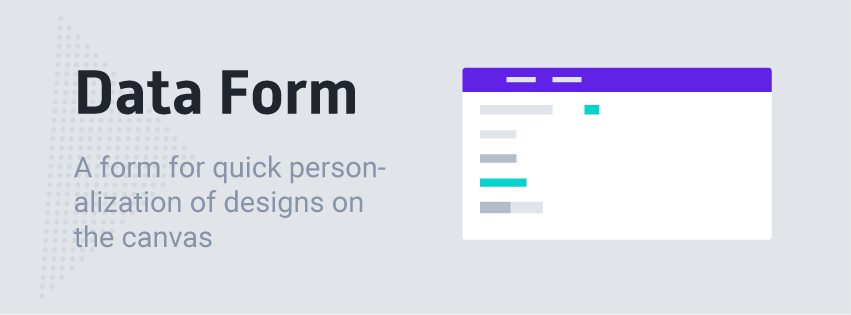 This is a PitchPrint module that shows a quick-edit form filled with data elements from the selected canvas. It allows customers to quickly customize their designs without reverting to moving and clicking items on the canvas.
A sample demo can be seen here: [Business Card with Data Form](https://wp.demo.pitchprint.io/product/business-card-data-form/)
Please note, this module is only available to Premium subscribers.
### How to Enable and Configure Data-Form module on a Design
To enable this feature, navigate to your [Designs page](https://admin.pitchprint.io/designs), simply click the Configure button on the design you like to assign this to. Then navigate to the Modules Tab. There you will find the Data Form module. Click to enable it and the configuration panel shows up as shown below:
This is a PitchPrint module that shows a quick-edit form filled with data elements from the selected canvas. It allows customers to quickly customize their designs without reverting to moving and clicking items on the canvas.
A sample demo can be seen here: [Business Card with Data Form](https://wp.demo.pitchprint.io/product/business-card-data-form/)
Please note, this module is only available to Premium subscribers.
### How to Enable and Configure Data-Form module on a Design
To enable this feature, navigate to your [Designs page](https://admin.pitchprint.io/designs), simply click the Configure button on the design you like to assign this to. Then navigate to the Modules Tab. There you will find the Data Form module. Click to enable it and the configuration panel shows up as shown below:
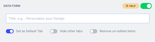 The configuration options are as follows:
The title you want to appear on top of the form. This can be left blank.
Shows the Data Form as the default tab, the first tab that appears in the design app.
Hides the Background, Picture and Text tabs, letting you limit what customers can add or customize in the design.
Gives customers the ability to change the background color or image of the pages.
When a user uploads their pictures, they are taken to the image editor right away.
Shows the image editor with the crop tool when a customer uploads a background image, so they can crop it to exactly fit the canvas dimensions.
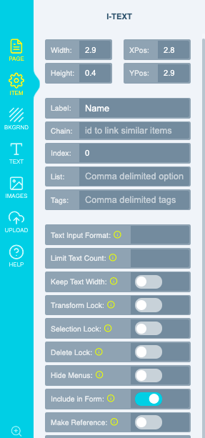
When you enable this module, the application looks through your design page by page for elements with the following properties:
1. **A Label.**
2. **Include in Form set to True.**
If you do not see your elements, kindly edit your design and make sure your have set a label to each element you want to include in the form as well as set the include in form switch to **ON** as shown:
The configuration options are as follows:
The title you want to appear on top of the form. This can be left blank.
Shows the Data Form as the default tab, the first tab that appears in the design app.
Hides the Background, Picture and Text tabs, letting you limit what customers can add or customize in the design.
Gives customers the ability to change the background color or image of the pages.
When a user uploads their pictures, they are taken to the image editor right away.
Shows the image editor with the crop tool when a customer uploads a background image, so they can crop it to exactly fit the canvas dimensions.
When you enable this module, the application looks through your design page by page for elements with the following properties:
1. **A Label.**
2. **Include in Form set to True.**
If you do not see your elements, kindly edit your design and make sure your have set a label to each element you want to include in the form as well as set the include in form switch to **ON** as shown:
 **Shapes** - For Shape items you intend to use as clips / masks, please do ensure to enable the ***Clickable Mask option***
**Index -** A new feature also allows you to specify and index (priority) for each item. The default index is 0 for all items. To give an item a higher priority, you should give it a higher number so it's displayed first. To display an item at the bottom, you can assign it a negative value, say -2 and like that..
This module appears as shown in the app: You may want to check out **[How to enable the customization form](/docs/tutorial/how-to-enable-the-customization-form)**
## Related articles
Let customers mass-customize a design by uploading data from Excel or CSV files.
Watch a video walkthrough of the Data Form module.
Automatically reflect a signed-in customer's details in their design from your cart framework.
Set up a quick-fill form that appears as soon as the app loads for faster edits.
This documentation is built and hosted on [Mintlify](https://mintlify.com), a developer documentation platform.
**Shapes** - For Shape items you intend to use as clips / masks, please do ensure to enable the ***Clickable Mask option***
**Index -** A new feature also allows you to specify and index (priority) for each item. The default index is 0 for all items. To give an item a higher priority, you should give it a higher number so it's displayed first. To display an item at the bottom, you can assign it a negative value, say -2 and like that..
This module appears as shown in the app: You may want to check out **[How to enable the customization form](/docs/tutorial/how-to-enable-the-customization-form)**
## Related articles
Let customers mass-customize a design by uploading data from Excel or CSV files.
Watch a video walkthrough of the Data Form module.
Automatically reflect a signed-in customer's details in their design from your cart framework.
Set up a quick-fill form that appears as soon as the app loads for faster edits.
This documentation is built and hosted on [Mintlify](https://mintlify.com), a developer documentation platform.